
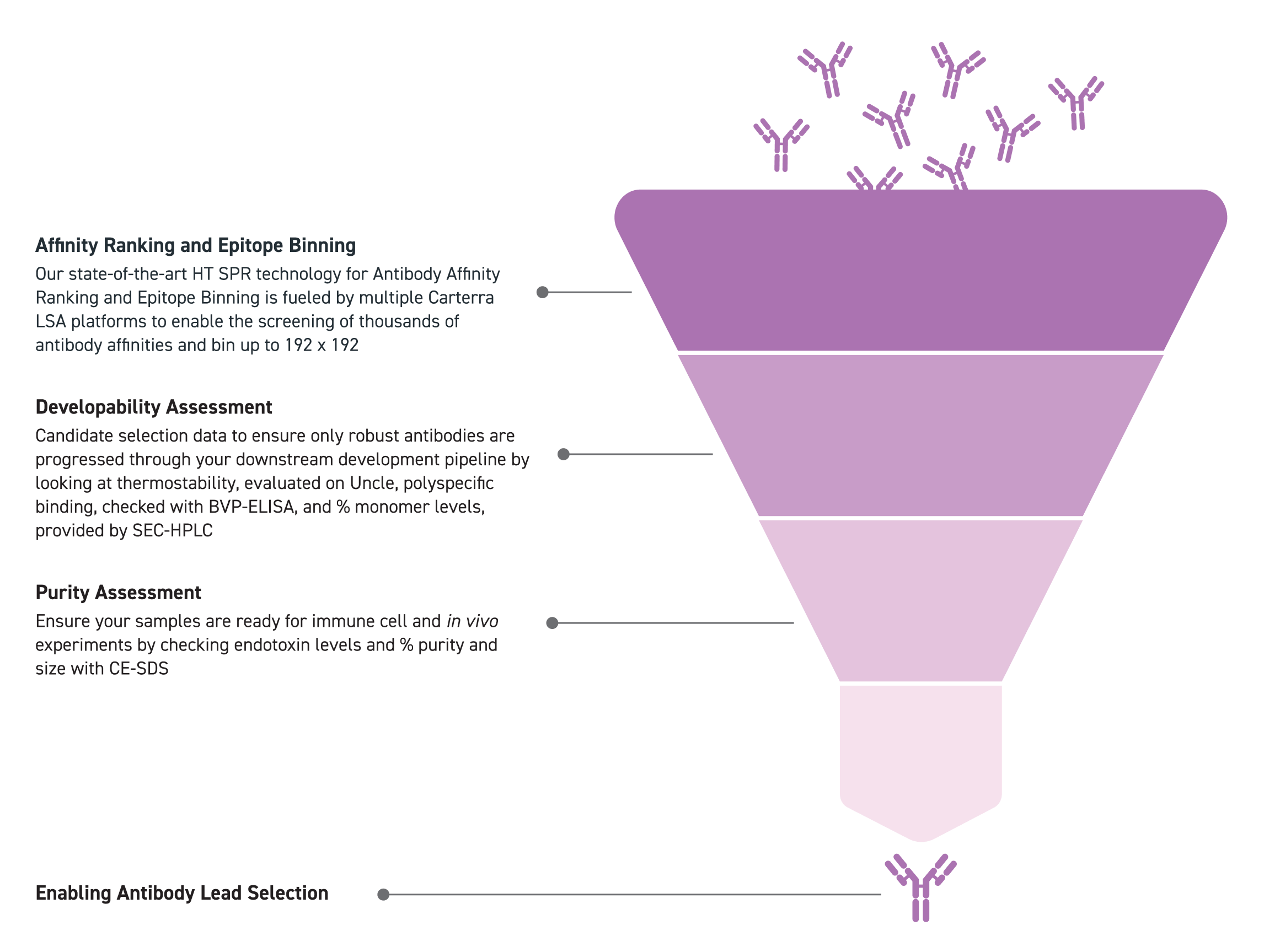
Antibody Characterization and Screening Services done for you
Twist Bioscience provides a complete on-demand Gene to Antibody high-throughput production and screening service to help centralize and streamline your antibody discovery workflow. We offer a set of characterization and screening services that can help:
- Increase screening throughput to tens to thousands of antibodies
- Select the most robust antibodies candidates to move forward with based on affinity, sequence, titer, and stability
- Prepare for in vivo testing
How does it work?
Twist will create custom antibodies based on user-defined sequences and perform the following screening and characterizations.
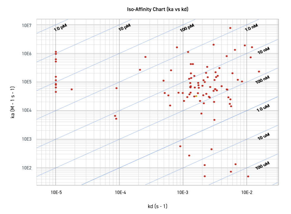
Affinity ranking used to select robust, functional antibodies
Figure shows the distribution of antibody affinity in the context of on-rate (ka) and off rate (kd). The y-axis represents the on-rate (ka), in which the antibody binds to the antigen. ka is dependent upon antigen concentration (M) and time (seconds). The x-axis represents the off-rate (kd), in which the antibody dissociates from the antigen. kd is dependent upon time (seconds). KD is a ratio of kd/ka, and represents apparent affinity in molarity— as such, a smaller KD value represents higher affinity. The location of the red dots represents the ka and kd of each antibody. The red dots are grouped into their respective KD ranges-- sections are denoted by the blue diagonal lines.
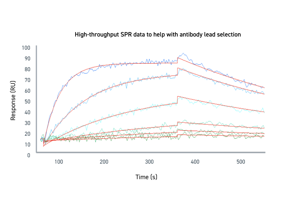
High-throughput SPR data to help with antibody lead selection
Binding was measured at a range of concentrations and globally fit to estimate the KD. The lines on the sensorgram trend upwards during the association phase, in which the antibody binds to the target antigen. The lines trend downwards during the dissociation phase, as the antibody eventually falls off the antigen over the course of time. The various shades of blue lines represent the varying concentrations of target protein. The lines that exhibit a higher RU are associated with higher antigen concentration. The red lines represent the global fit of the data.
